
Skip to content

Summer Colour Trends with Print and Patterns for Soft Furnishings

Summer Colour Trends with Print and Patterns

Summer Colour Trends with Print and Patterns for Soft Furnishings

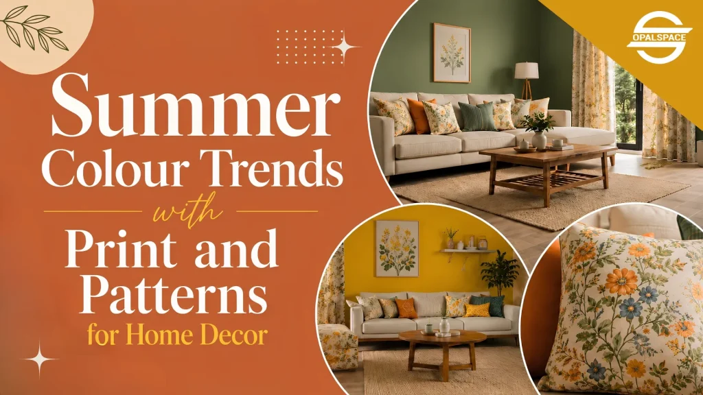
If not summer, then what better time to refresh your home interiors? Scorching temperatures make home interiors look dull and heavy. Summer is the perfect excuse to run through colour trends again, like in wall colours, wallpaper designs, curtains, cushions, and decorative textiles.

Table of Contents

As summer arrives, it brings with it the coolest, brightest, and most playful colour trends. And that’s not all; it also brings the perfect opportunity to introduce trending prints and patterns that make the most of the season. Temperatures are soaring across major cities like Delhi NCR. And the scorching summer heat makes heavy colours and dense patterns feel suffocating. Prolonged heat makes home interiors retain heat, and they become stuffy, boring, and tiring. Wall colours and wallpaper designs can help your home interiors capture the cheerful spirit of summer. Rich prints and patterns for upholstery and soft furnishings express the seasonal charm throughout your space.

What are the Summer Colour Trends for Home Interiors?

Summer colour trends draw inspiration straight from nature and long sunlit days. The objective behind using these colours is to make your home lively and breathable. You can adopt this season’s palette with vibrant and not-too-loud colours. These trending colours find a place throughout your home through wallpaper design, wall colours or decorative textiles. The following colours break away from plain white palettes to get rid of boredom. At the same time, they are subtle enough for summer. 

1. Dusty Blue

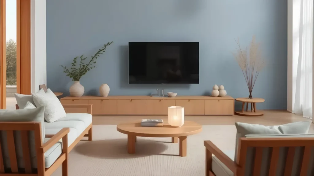
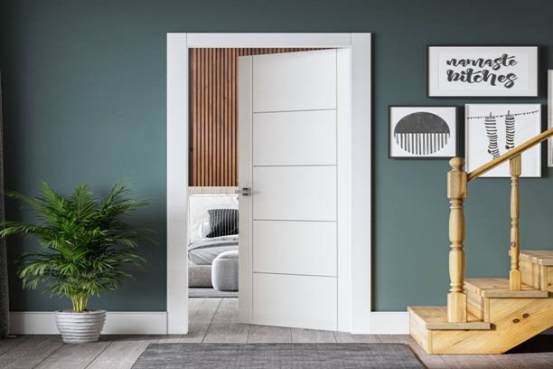
Dusty blue carries the calmness of the sky and water. It is one of the variants of muted blues. It looks equally beautiful on bedroom walls, living room accents, curtains, and upholstered furniture as well. In order to make a workable combination, you can use natural wood, white, and soft grey with this shade.
Dusty Blue wall colour

2. Sunlight Glow

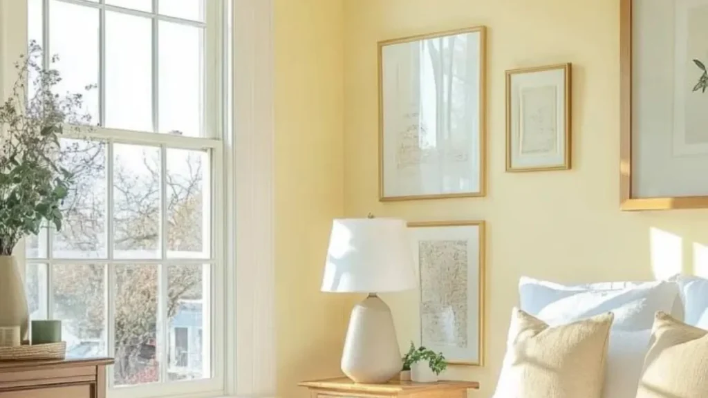
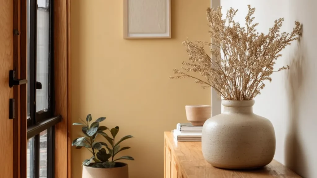
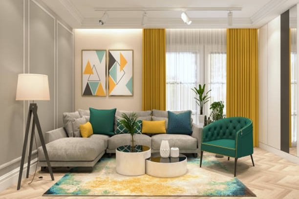
Sunlight Glow has a cheerful yellow tone. This tone brightens interiors during summer. You can use it on accent walls, cushions, table linen, or decorative accessories. The colour mixes well with white, beige, and light wood finishes.
Sunlight Glow wall colour

3. Moss Green

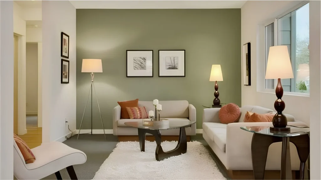
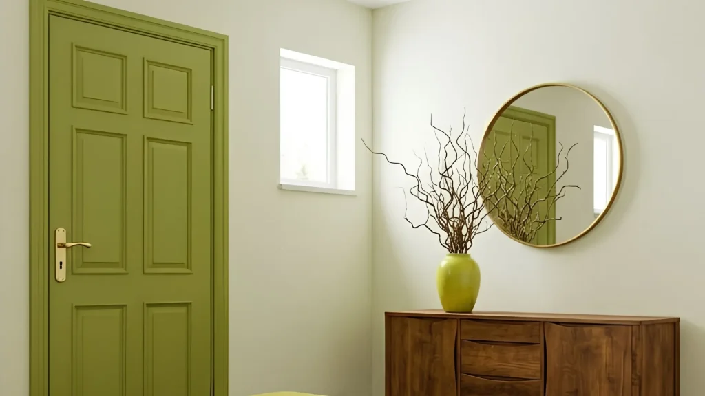
Moss green draws inspiration from natural foliage. You can place indoor plants and earthy textures to amplify the influence of this trending shade. It looks pleasing on feature walls, furniture with upholstery, and botanical print furnishings.  Beige, off- white, and wood finishes are the best combination of colours for moss green.
Moss Green colour

4. Caramel Orange

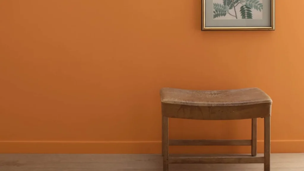
Caramel orange has an earthy and sun-baked tone. This trending colour comes from Mediterranean and rustic themes. Professional interior designers recommend this shade for rugs, accent chairs, throws, or pottery-inspired decor. You can mingle this summery hue with soft neutrals and natural materials to balance its richness.
Caramel Orange colour

5. Squash

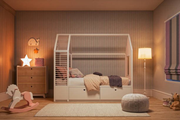
Squash carries a mellow golden yellow with soft orange undertones. This sunny summer palette grows out of ripe summer squash and golden sunlight. When you apply it to kitchens, dining areas, breakfast corners, and children’s spaces, it opens the room to natural brightness. It is subtle and not overly loud
Squash colour trend

6. Wasabi

Wasabi is a shade of muted green. It has a free green-yellow tone. This summery colour energises interiors and complements contemporary summer palettes. It coordinates pleasingly with accent walls, artwork, cushions, and patterned textiles. If you want to strengthen its seasonal appeal, you can use natural cane, rattan, and light wood tones.
Wasabi colour trends

7. Rich Greige

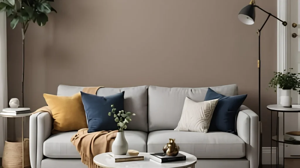
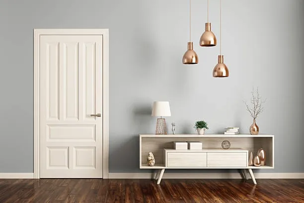
Rich greige is a combination of grey and beige colours. Rich greige. It provides a sophisticated neutral base for someone who wants to go with minimalist interior design. It is versatile enough for large walls, sofas, rugs, and layered textiles.
Rich Greige colour trend

Summer Prints and Patterns for Soft Furnishings with Colour Trends

It’s summer, and the colours alone may not convey the full story. So, there are stylish prints and patterns to complete the look. The striking combination of the above colours and the following prints and patterns welcomes the beauty of the season into your interiors. You can use them in your cushions, rugs, curtains, other soft furnishings, and decorative textiles.

1. Stripe Pattern

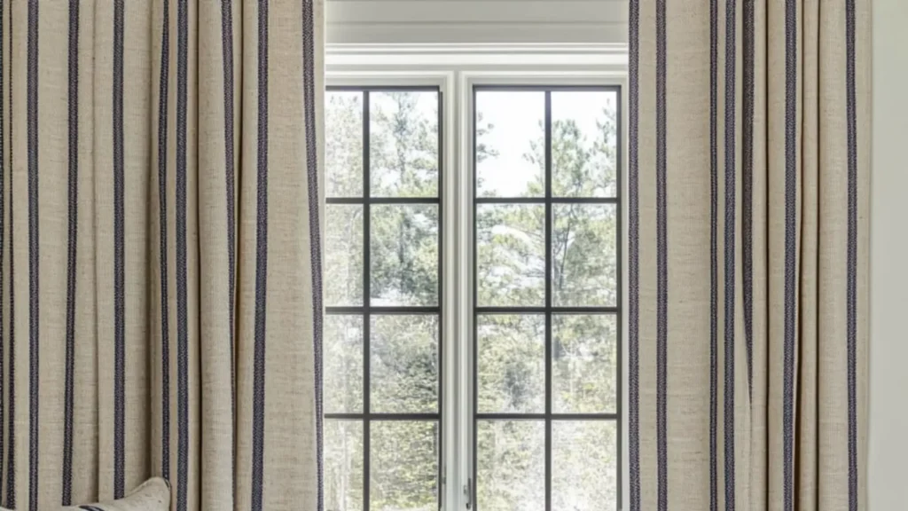
Stripes never go out of fashion. When you use this pattern in your curtains, cushions, and rugs, they get a crisp and polished appearance. Stripes in summer with a summer colour palette are the most fashionable statement, especially on your pillowcases, cushion covers, sofa covers, and curtains, etc.
Stripe Pattern

2. Leafy or Floral Print
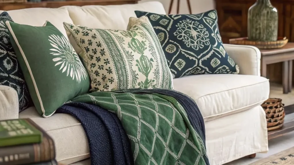
Leafy and floral prints come from the botanical design category. The botanical motifs present here make soft furnishings look lively. This summer pattern welcomes nature indirectly into your space, and how beautiful is that in the season?
Leafy or Floral Print

3. Checks

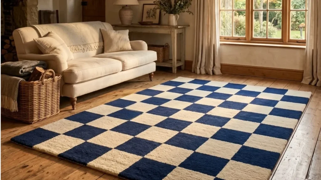
Checks never struggle to find a place in home decor. They have an illusory effect and a technically symmetrical arrangement. There is a wide variety of check patterns like small checks, large checks, ginghams, b/w checks, and designs in many summer colour palettes. These are the best decorative textile options for someone who loves something extraordinary.
Checks Pattern rug

4. Abstract Patterns

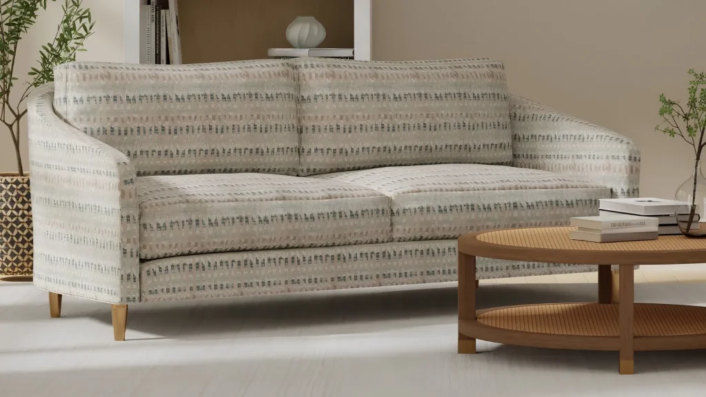
Abstract patterns are the derivative of modern art. They are very artistic and catch your attention at a glance. They have unconventional forms that harmonize with contemporary interiors. Be sure you mix this pattern with summer colour trends to make it stand out. You can freely use these on cushions, rugs, and other decorative textiles to modernize your home interiors. 
Abstract Patterns

5. Black and White Patterns
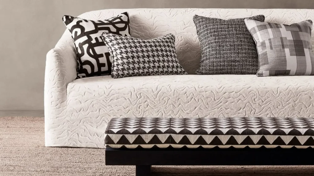
If you’re on the bolder side when it comes to soft furnishings, black and white patterns should be your first choice. There are plenty of designs available with strong contrast that highlight the surrounding colours. To bring a pinch of drama to your interiors, You can use them for rugs, cushions, and upholstery.
Black and White Patterns

6. Ethnic Indian Prints
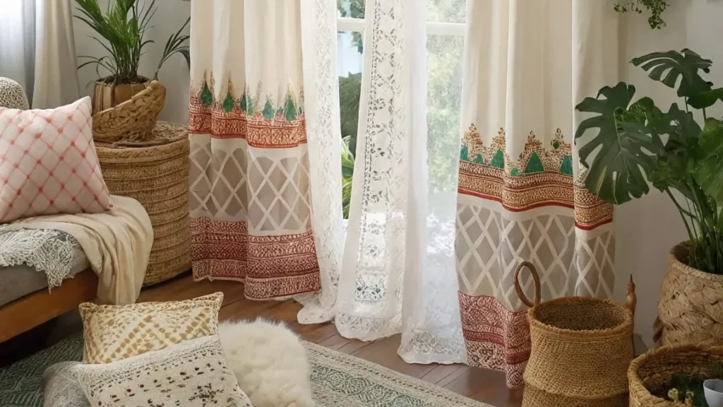
Ethnic Indian prints celebrate traditional artistry and make draperies look richer. Indian style interior design and decor are still thriving. These prints and patterns with all those natural motifs (animals, symbols, indigenous art) are all about bringing authenticity to bedding, curtains, draperies, and other fabric elements.
Ethnic Indian Prints in home interior

7. Frills and Ruffles

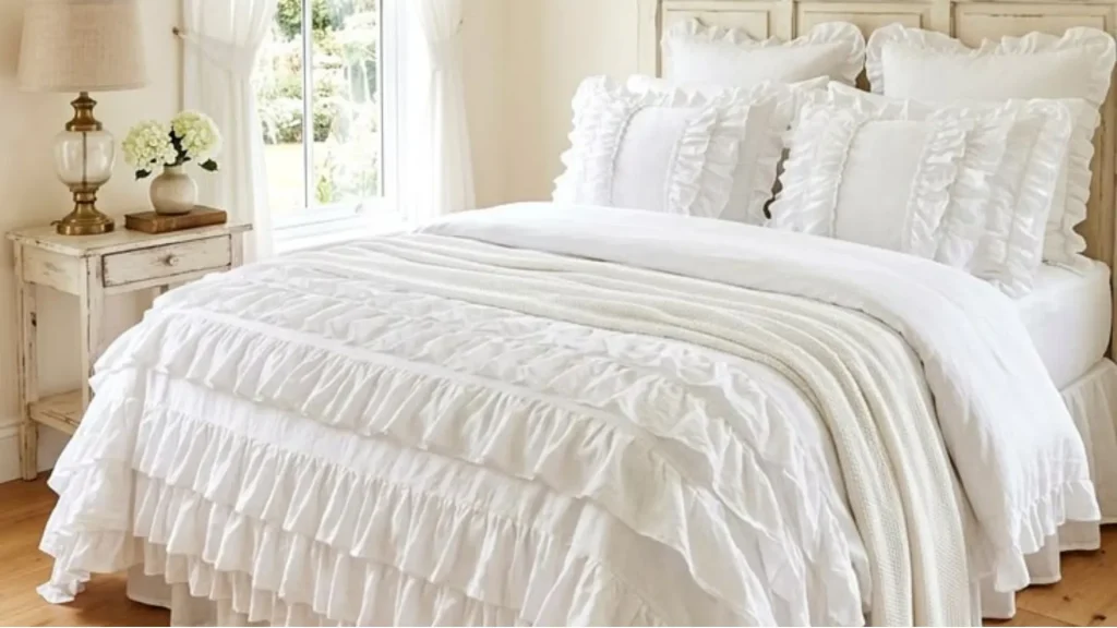
Frills and ruffles are fun details in decorative textiles. The layered edges of the draperies give soft furnishings a fuller and more decorative appearance. These are both fun and graceful elements at once. Stripe patterns and frills go hand-in-hand with the trending summer colour palette. This pattern suits light summer fabrics like nothing else.
Frills and Ruffles use as bedsheet

How to Pair Summer Colour Trends with Popular Prints and Patterns?

You must pair summer colour trends with modern prints and patterns in thoughtful combinations to capture the full essence of summer throughout your space. Because colours catch attention, but print patterns give direction to the entire design with depth and dimension.

Summer Colour TrendsPrint and Pattern for Draperies
Dusty BlueStripe Pattern
Sunlight GlowBlack and White Pattern
WasabiLeafy or Floral Print
Caramel OrangeEthnic Indian Prints
Moss GreenChecks
Rich GreigeAbstract Patterns
SquashFrills and Ruffles

Welcome Summer Colour Trends to Your Home with Opalspace

Summer colour trends awaken home interiors through rejuvenating colour palettes, decorative textiles, prints, and patterns. The right combinations give your rooms an enriching seasonal look. And these combos also make your home look well put together. Opalspace can help you upgrade your home interiors with the latest colour palettes and home decor this summer. We also provide end-to-end home interior design services, cover design consultation, material selection, manufacturing, installation, and project execution under one roof.

FAQs

1. What are modern colors to paint the interiors of a house?

Modern home interiors favour nature-inspired shades such as dusty blue, moss green, rich greige, soft taupe, caramel orange, and muted yellows. These colours pair well with natural wood, decorative textiles, and contemporary furnishings. They also suit living rooms, bedrooms, kitchens, and feature walls.

2. What is the luxury color for summer?

Rich Greige stands out as a luxury summer colour because it gives interiors a refined neutral foundation. Dusty Blue, Moss Green, and Soft Taupe also complement premium materials such as wood, marble, linen, and cane, making them popular choices for upscale homes.

3. Can you make a nice room if you hate warm colors?

Yes, you can make a nice room without warm colours. Cool colours like blues and greens recede in space and evoke a quieter, more restful mood. This calming effect works well for bedrooms, bathrooms, or any room where you want a soothing retreat. Use neutrals like white, grey, or black to anchor the space and keep the look balanced.

4. What colors would go well with rich greige?

Rich Greige pairs beautifully with dusty blue, moss green, caramel orange, sunlight glow, soft white, beige, and natural wood tones. These combinations work well across walls, upholstery, curtains, rugs, and decorative accessories.

5. Which color is replacing grey in 2026?

Rich greige, soft taupe, earthy greens, muted blues, and clay-inspired shades continue to gain popularity in 2026. Homeowners now prefer these colours because they bring greater depth and character than cool grey palettes, particularly in living rooms and bedrooms.

Leave a Reply

Your email address will not be published. Required fields are marked *

Opalspace-logo.png
We transform your dream homes into beautifully and intelligently designed realities.

Our Gallery

Contact Info