Table of Contents
A Kitchen is more than just a place to cook. It shows how we care for our loved ones. We share food and time here. It also brings a sense of comfort and belonging. The look of a kitchen depends on more than layout. Colour plays a key role. When you pick colours, keep three things in mind. Check the room size. Look at the natural light. Decide on the design you want.
You can also use a two-tone cabinet scheme. Use one color for upper cabinets. Use another for lower cabinets. This adds depth and gives the whole kitchen interior a modern look. It keeps the space clear and balanced.
You can also use a two-tone cabinet scheme. Use one color for upper cabinets. Use another for lower cabinets. This adds depth and gives the whole kitchen interior a modern look. It keeps the space clear and balanced.
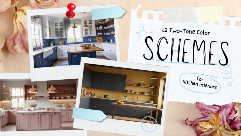
What are Two-Tone Kitchen Color Schemes?
A two-tone kitchen color scheme uses two different colors in one kitchen. The upper cabinets use a lighter shade. The lower cabinets use a darker or richer tone. This layout keeps the upper area bright and the base grounded.
A light upper unit pairs best with a dark or warm-toned base. Some well-known combinations include white and charcoal, forest green and cream. You can also use navy with white, sage with natural wood, or terracotta with linen.
A light upper unit pairs best with a dark or warm-toned base. Some well-known combinations include white and charcoal, forest green and cream. You can also use navy with white, sage with natural wood, or terracotta with linen.
Why Two-Tone Kitchen Color Scheme?
The two-tone kitchen interiors is a strategic design approach that:
- enhances spatial perception
- encourages customization
- improves functionality
- creates attractive focal points
- strikes a balance between trendy flair and timeless appeal
- leverages psychological color dynamics to shape how you feel in the space
How to Incorporate Two-Tone Kitchen Cabinet Color Schemes?
1. Choose a Focal Point
- Choose a Focal Point
It is recommended to pick one main spot to show off the two colors. For example, use the kitchen island or the lower cabinets. This makes the two-tone look planned. - Use Light and Dark Strategically
Use light colors on the upper cabinets. This keeps the kitchen feeling open. Use dark colors on the lower cabinets. This gives the kitchen a strong, steady base. - Maintain Color Balance
You should keep the two colors in balance. A good rule is 70/30/ or 60/40. That’s why one color doesn’t take over, and they don’t fight each other. - Add Subtle Accents
You can use your accent color in small ways. Put it on a bar stool, the backsplash, or cabinet handles. These tiles all the colors together nicely. - Leverage Natural Light
Put your darker colors in areas with good natural light, like near a window or a skylight, so they won’t look flat or too heavy. And for the lighter upper cabinets, place them in areas that don’t get as much light. - Layer Your Lighting
For lighting, try to layer it. Use recessed lights for general brightness, add some LEDs under the cabinets, and hang pendants over the island or prwp area. - Keep Hardware Consistent
Stick to one hardware finish across the kitchen. This keeps the look consistent. For example, use brass on all cabinets. You can also use matte black or stainless steel. - Connect with Surfaces
Use countertops and backsplashes as a bridge between cabinet colors. Marble with grey veining works well here. It connects white upper cabinets with charcoal lower ones. - Mix Finishes for Texture
Try mixing finishes for surface texture. Use glossy upper cabinets. Pair them with matte lower cabinets. This keeps the design balanced and clear. - Focus on Durability and Timelessness
Choose durable materials and timeless color combinations to ensure your kitchen remains practical, easy to maintain, and visually appealing over time.
Two-Tone Color Schemes for Your Kitchen Interiors
Here are the best kitchen colour combination options that will help you enhance your kitchen’s look.
1. Satin White and Dark Grey/Charcoal Color Scheme
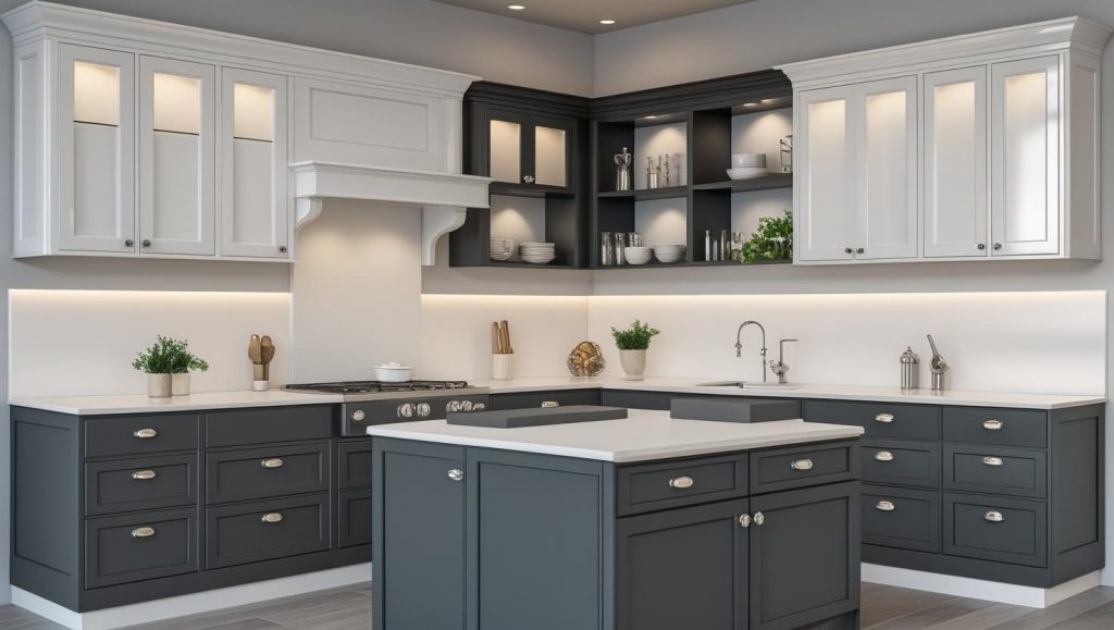
- Pair your white uppers with dark grey or charcoal lowers to create a sense of height, depth, and visual interest.
- The contrast brings in brightness for the ceiling and adds heft to the base.
- This put-together look may transform a small kitchen into a larger one.
- Matte grey lower cabinets resist marks, while glossy or stain white uppers play with light and present a very clean look.
- For hardware, try brushed metal, brass, or matte black.
2. Forest Green and Off-White /Cream Kitchen Color Scheme
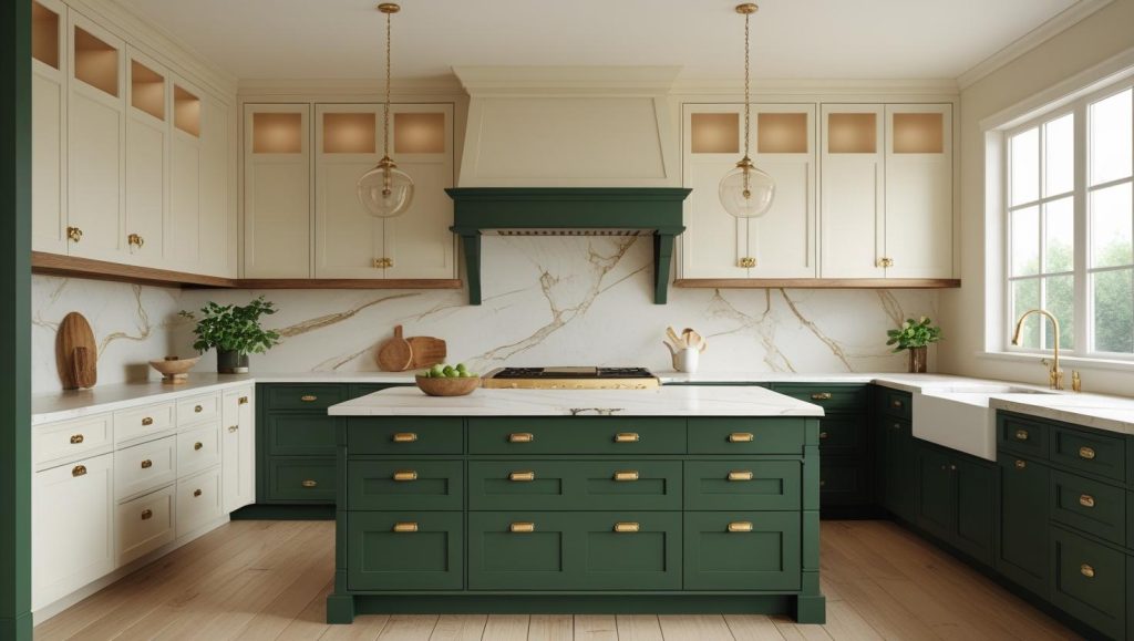
- Forest green base cabinets go with cream or off-white top cabinets, which creates a warm, inviting kitchen.
- The forest green brings in a very natural, earthy feel, and the cream keeps the upper cabinets light.
- Gold or brass handles really pull this look together.
- White or cream for the countertops and back splashes also does very well with the mostly dark bottom colors.
3. Sage/ Olive Green and Natural Wood Color Scheme
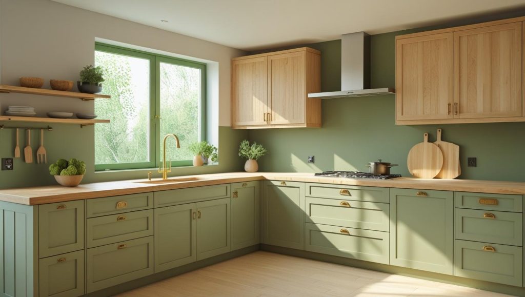
- Sage and olive green tones present a tranquil and rooted atmosphere.
- Natural wood brings in warmth and texture, which in turn stops the green from looking too cool or flat.
- This kitchen colour combination is widely used because it radiates plenty of natural light.
- For brass or matte black hardware, you have the choice between warming up the kitchen or giving it a very modern feel.
4. Two-Tone Wood Color Scheme for Your Kitchen
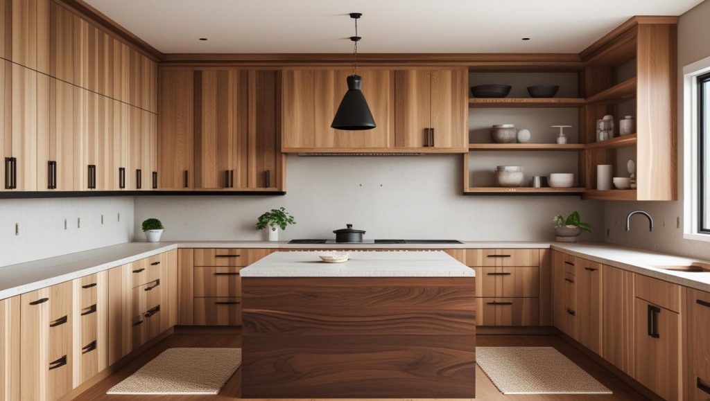
- Mix in a wood type that is light, such as ash or maple, with a darker wood like walnut.
- In terms of the upper cabinets, go for a lighter tone, which in turn will open up the kitchen.
- For the lower cabinets and island, use the bolder colors for that extra dimension.
- You don’t have to match the woods exactly, but do try to keep the color undertones in the same family.
5. Navy Blue and White Color Scheme
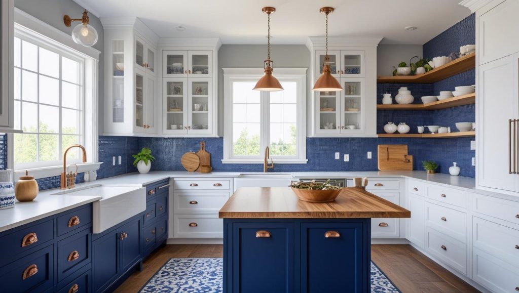
- Navy bottom cabinets that pair with white uppers are a very classic kitchen color scheme.
- White keeps the kitchen looking fresh and bright, while the navy brings in a more grounded look.
- Also, you can use navy on the island if you don’t want to go all-in on lower cabinets.
- For hardware, brass, copper, or matte black all go very well with this combo.
6. Charcoal and Mustard Yellow Color Scheme
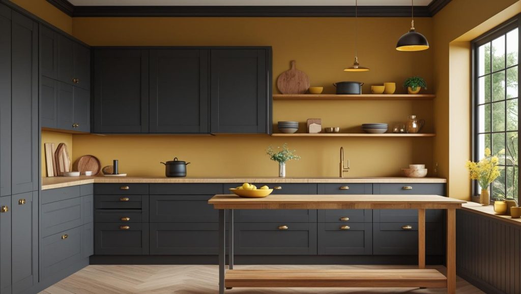
- Charcoal brings in the depth, at the same time mustard yellow brings in warmth and personality.
- Mustard is used as an accent in upper cabinets, on an island, or on a breakfast bar as opposed to full kitchen use.
- Matte charcoal is very timeless, and a soft sheen on the mustard can brighten it up.
- Wood elements and warm lighting help to even out the contrast.
7. Terracotta and Linen White Color Scheme
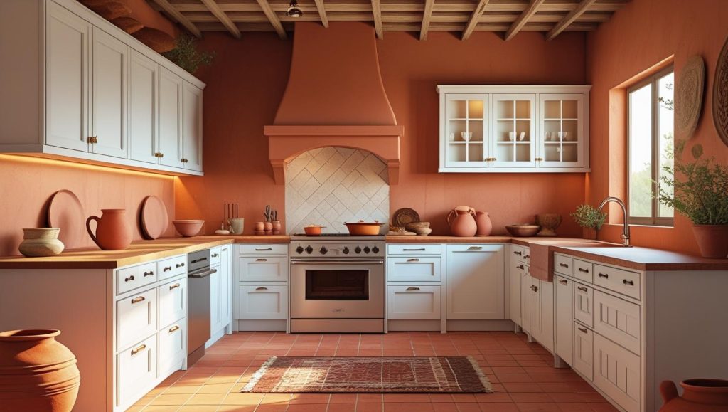
- Linen white cabinetry with terracotta in the island or lower cabinets creates a soft, earthy kitchen.
- White’s warm tones help tie the palette together.
- Natural stone, wood tops, and terracotta tiles pair very well with this look.
- This scheme works in Mediterranean and farmhouse-style kitchens.
8. Dusty Rose and Light Wood Color Scheme
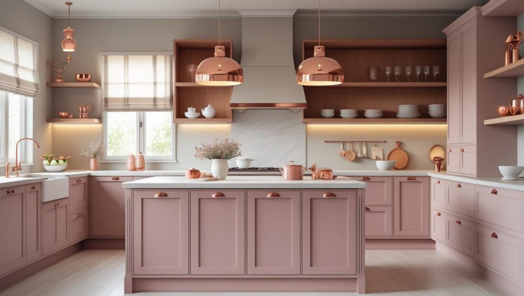
- Dusty pink on base cabinets or the island goes well with light oak or ash, which in turn creates a very soft and elegant look.
- We see that a matte or satin finish of the dusty rose color keeps it very subtle and modern.
- For hardware, we recommend copper, brushed brass, or matte black to round out the palette.
- This color scheme does very well in Scandinavian, minimalist, and cottage-style kitchens.
9. Soft Coral and Cool Mint Kitchen Color Scheme
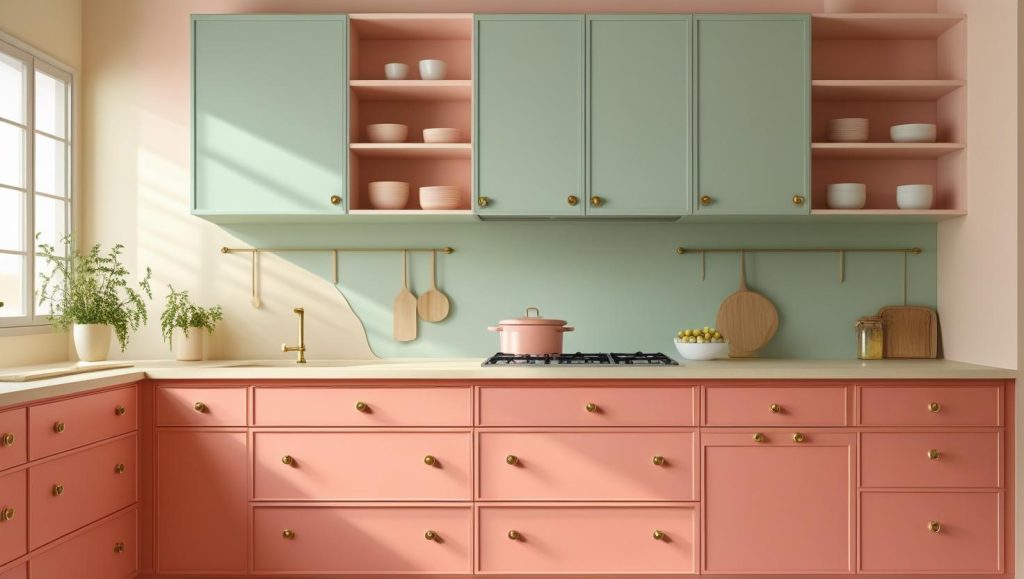
- Soft coral cabinetry for the bottom and cool mint for the top bring a very fresh and fun look to the kitchen.
- The soft coral is the anchor, which is gentle in the space, and the mint adds in that lightness.
- We recommend a matte finish for the colors so they do not become too bright or overwhelming. This combo works particularly well in kitchens that have lots of natural light.
10. Ocean Blue and Sandy Beige Color Scheme
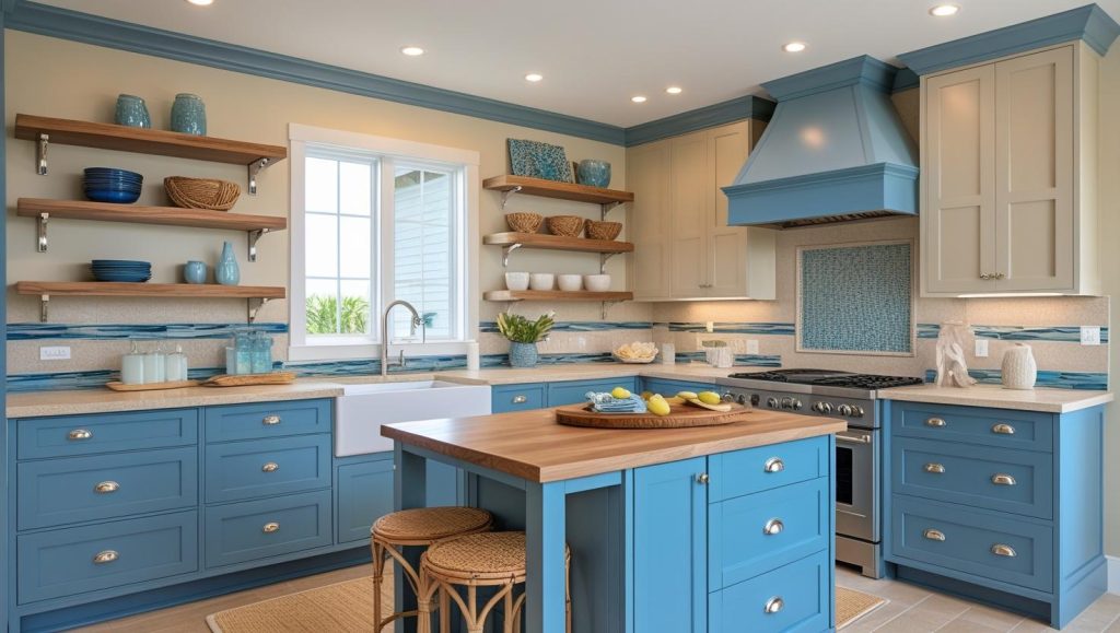
- Once blue in the base cabinets and island, and for the uppers, a sand beige creates a very calm coastal look.
- The blue is the sea, the beige the sand.
- Driftwood shelves, rattan stools, and trek counters fit into this scheme perfectly.
11. Deep Burgundy and Cream Kitchen Color Scheme
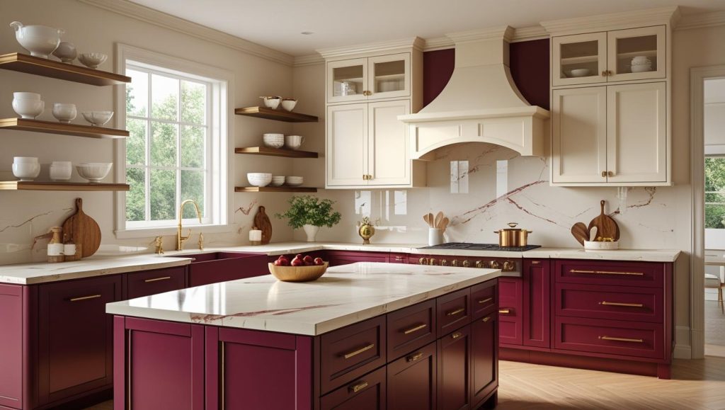
- Deep rust colored lower cabinets and a central island bring out a lot of depth and sophistication.
- In the upper cabinets, we see a neutral cream which balances out the intensity and prevents the kitchen from looking too heavy.
- Also, doing very well with this color scheme are cream marble tops, gold-toned hardware, and natural wood floors.
12. Purple and Grey Color Scheme for Your Kitchen Interiors
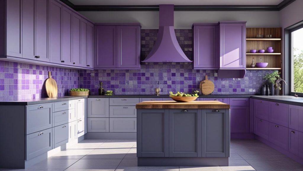
- If you put pastel on the upper cabinets and dark gray on the lowers, you will get a modern and sharp look.
- Lighter purples, like lavender or lilac, feel soft and current. If you go with deeper shades, like plum, the effect is more dramatic.
- Matte gray next to satin purple is a nice pairing. It comes across as very elegant.
- Wood elements and ample natural light help to make the purple-gray combination work.
Design Your Perfect Two-Tone Kitchen with Opalspace
The right two-tone kitchen color scheme has to do with how you want your space to feel every day. Either you lean toward calming contrasts or striking combinations, the right pairing completely shifts the mood and movement of your kitchen. If you’re still wondering which colour duo suits your space and style best, let Opalspace help you translate ideas into beautiful, functional reality. Because great design starts with a conversation.
Beyond Kitchen interiors and kitchen color schemes, we offer complete interior design services, from modular kitchens and wardrobes to bedroom makeovers, smart storage ideas, and full home renovations. Whatever your space or style, Opalspace is here to make your home more functional, beautiful, and truly yours.
Beyond Kitchen interiors and kitchen color schemes, we offer complete interior design services, from modular kitchens and wardrobes to bedroom makeovers, smart storage ideas, and full home renovations. Whatever your space or style, Opalspace is here to make your home more functional, beautiful, and truly yours.
FAQs
1. What are the main features that define a modern kitchen design?
A modern kitchen design is characterized by its emphasis on clean lines, minimalism, and functionality. You will often see sleek, handle-less cabinets, integrated appliances, and a clutter-free countertop. The use of materials like stainless steel, glass, and engineered stone for countertops is common, all contributing to a streamlined and efficient cooking space that feels both sophisticated and practical.
2. What is the primary advantage of choosing a modular kitchen over a traditional one?
The biggest advantage of a modular kitchen is its customizability and efficiency. Since it is built from pre-made cabinet and storage units, it can be designed to fit any kitchen layout perfectly, maximizing every inch of available space. This approach also typically allows for a faster and more organized installation process compared to traditional, site-built cabinetry, and it offers great flexibility for future updates.
3. I'm planning my kitchen interiors and feel overwhelmed. Where should I start?
A great place to start is by considering the work triangle, which is the path between the sink, the stove, and the refrigerator. Ensuring these three points have an efficient flow is the foundation of a functional kitchen. From there, you can focus on your storage needs, countertop workspace, and the overall aesthetic you want to achieve, whether it's a sleek modern look or a more warm and inviting style.
4. What are some good kitchen color schemes for a smaller kitchen to make it feel larger?
To make a smaller kitchen feel more open and airy, light and monochromatic color schemes are most effective. Using varying shades of the same light color, like soft grey on the cabinets with a white countertop and a similar-toned backsplash, can create a seamless look that visually expands the space. Incorporating a reflective backsplash, like a glossy subway tile, will also help bounce light around the room.
5. Is it better to have kitchen cabinets that go all the way to the ceiling?
Yes, in most cases, opting for cabinets that extend to the ceiling is a wise decision. This design eliminates the dusty, hard-to-reach gap on top of standard cabinets, giving you a cleaner look and more storage space. You can use the upper section for storing items you don't need frequently. If you're concerned about accessibility, a popular solution is to have functional cabinets below and shallower, decorative cabinets on top.